
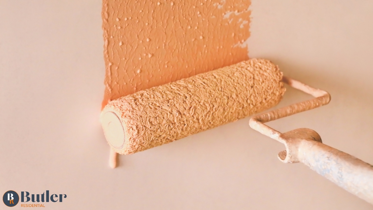
Believe it or not Dead Salmon is making a splash in 2021.
We had our kitchen transformed last year by a local builder https://bwoodcraft.com/index.html just before the first lockdown and when looking at endless shades of pink I, (Laura) really liked the shade Dead Salmon (yes, that really is what it's called.) It's not quite the colour in the picture but you get the idea. I just couldn't bring myself to have our kitchen and dining walls painted in such an awful named paint shade. Plus I don't even like salmon - controversial.
For millions of us Brits, getting through this pandemic has been a case of “Keep Calm and Carry On with DIY”.
To stop ourselves from climbing the walls from boredom and frustration, we turned to painting them.
As a result, DIY chains such as B&Q have recorded surging sales, while paint company Dulux had to ration the sale of paint pots and testing kits last year to cope with rising demand.
As so many people are giving their homes a fresh lick of paint right now, let’s look at what’s popular in the world of colours.
Call Of the Wild
A few years ago, magnolia was very much the colour du jour for interiors (in fact, just about every property that came on the market was a vision of yellowy-white).
The perceived wisdom was that magnolia was the best way to create a welcoming but neutral base for home decorating.
But times have changed, paint firms and interior design experts report that being cooped up so much over the past year has made us yearn for nature and fuelled a desire to bring a little bit of the great outdoors indoors.
As a result, earthy tones are the “new magnolia”.
It’s Only Natural
Dulux’s Colour of the Year 2021 is Brave Ground, a warm natural shade with a strong brown undertone (some cynics call it beige).
While over at Farrow & Ball, the earthy brown tone Jitney is popular, as is Satin Slipper (an off-white shade akin to a traditional ballet slipper) and that good old shade we mentioned earlier, Dead Salmon.
The Little Greene Paint Company has also jumped on the ‘earthy’ bandwagon by unveiling Stone, a range of 36 natural colours that includes the warm neutrals Portland Stone and Travertine.
Meanwhile, Valspar has Seven Sisters or the very bold Aged Cognac.
Greens and Blues (Butler Residentials favourite shades)
Many home renovators are also looking to create tranquil, calm spaces at home (perhaps to counteract all the stress from homeschooling and Zoom calls).
As a result, blue and green shades are proving popular. Valspar has Sapphire Earbobs, Secluded Cove and Cobblestone Moss, while Farrow & Ball has Green Smoke and Card Room Green, and Ultramarine Blue and Stiffkey Blue (a navy that we’ve seen used in lots of Victorian terraces).
We plan to paint our lounge in a dark green shade, it's my favourite colour and with three boys on the loose, i'm hoping to create a calmer living space.
Should St Neots Homeowners Stay Neutral or Make a Statement?
Potential buyers can indeed find bold colours and strong prints a turn-off when viewing a property.
But to state the obvious, it is your home, so of course it should reflect your tastes. The great thing about paint is you can paint over it.
So, if you are going to opt for bold colours, use them on the walls, you can go over them later without too much trouble but stick to neutral tones for skirting boards and ceilings (which are fiddlier and faffier to reach). You could even try your hand at upcycling a piece of furntiure in a bold statement colour, which if you decide to move can be taken with you.
If you are thinking about your next move then contact us today and who knows, this blog may come in handy when you start looking at paint shades for your new home.
Copyright Butler Residential
I dedicate this blog to my friend Naomi whoI know has painted a wall or five during this lockdown!

Share this with
Email
Facebook
Messenger
Twitter
Pinterest
LinkedIn
Copy this link